
 Vincent Van Gogh has always been my favorite artist so I chose to study his work this semester. Starting with studying a flower, I incorporated Van Gogh's work with one and created my 2D concept, layering the two items. From the 2D I created a 3D room that was drawn from the same idea. I am happy with the outcome and feel it resembles something Gogh would do.
Wednesday, April 28, 2010
Process Poster
Vincent Van Gogh has always been my favorite artist so I chose to study his work this semester. Starting with studying a flower, I incorporated Van Gogh's work with one and created my 2D concept, layering the two items. From the 2D I created a 3D room that was drawn from the same idea. I am happy with the outcome and feel it resembles something Gogh would do.
Sunday, April 18, 2010
Resume

 By working on and creating a resume in InDesign and I continued to learn and grow. I became more familiar and comfortable working on InDesign and enjoyed exploring options and different techniques. It also forced me to write out my skills as a designer and find out what I have to offer. It was good practice for the future and very educating.
Monday, April 12, 2010

Here is a logo I created to use on various projects, resumes, letters, etc. I used tools on InDesign as well as Photoshop to create my logo. I wanted the logo to reflect my personality and taste. I used a bright orange and blue that I felt was more laid back and fun. I added the peace sign to represent free spirit and kindness. I am pleased with the final project and feel it's a good representation on myself and my taste.
Monday, March 29, 2010
Negative Space Sketch
Here is a sketch where I was working with negative space. Instead of drawing the objects like the tree and ground, I shaded in the negative space. All the dark shading is actually the sky and gaps in the tree. 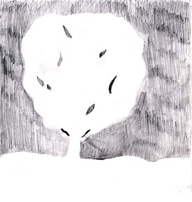

Object Sketch
This is a sketch I did of a literature book and pair of reading glasses. My focus was on making the sketch realistic and proportional. If I were to make it better I would add more detail, for example add shading and texture. 

Plant Sketch
Here is a sketch I did at the beginning of the semester of two live plants. I was focusing on accuate proportions and shading. If i were to do it again I would use a hit-go-hit drawing style to get more precise, bold lines. 

Wednesday, March 24, 2010

Here is a project to work on photoshop along with learn a bit about my heritage. I started by reseaching my Irish heritage and found out a lot of important symbols the Irish cherish. I tokk the clover and then layed the Irish flag of top. By changing the opacity, one can see the clovers underneathe the flag. I also used a circle which symbolizes eternity. I altered the cirle with carious tools in photoshop to make it more interesting to look at. The Claddagh within the cirle represents love, loyalty, and friendship. I used the magic wand to cut out the shape and then altered it and changed the size so it could fit within the cirle.
Subscribe to:
Posts (Atom)