Friday, December 17, 2010

Bathroom Design


My first bathroom design was from inspiration from my concept model with the black and white contrast. I then brought in the color of yellow, inspired from the rolling wheat fields. I chose to keep the bathroom open, spacious and simple. Everything is wheelchair accessible with knee space under the sinks, a large roll-in shower and five foot turn around. I feel i progressed a noticeable amount from my past two rooms but still much room for improvement.

Grandparents Apartment


For my final design as a first semester sophomore, I brought everything together I have learned and created a apartment for the grandparents living with the family who has a member in a wheelchair. This apartment is wheelchair accessible so as the couple ages, if needed, the house will be able to grow with them through the struggles of aging. My color scheme came from the Palouse with the yellows of the wheat fields and the greens and yellows from the fall and summer. I'm very pleased with my final design, putting a great amount of effort into every part of the design.


Wheelchair Experience


Throughout my first semester as a sophomore interior design student, I was educated on accessibility in the home, and other buildings. To better understand the everyday struggles of someone with a handicap, I did an experiment where I traveled around campus in a wheelchair, attempting to perform regular tasks. It opened my eyes to how hard just opening a door or ordering a coffee is for someone who is in a wheelchair. I quickly became aware of the lack of accessibility throughout campus, with missing automatic doors for example. After doing this experiment, I had a much easier time putting design into perspective that was accessible to someone in a wheelchair.

Thursday, December 16, 2010

Kitchen Design Project


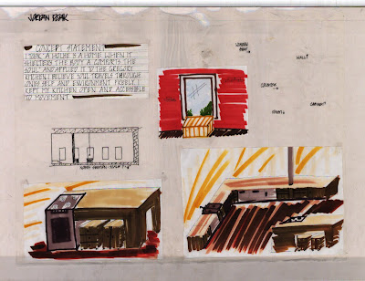
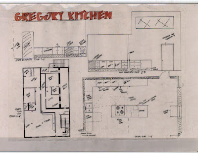
My first attempt at a room design was based on a kitchen accessible to someone in a wheelchair. It was based in a old loft on the main street of Pullman. I used colors that resembled the Palouse because that was part of the clients favorite part of the area. It was definitely a rough design, becoming familiar with bringing all the components of design together to make a room.

Childs Room Project


My second room design was based on twin boys at the age of five. I pulled my inspiration from a childrens book that was based around discovery in nature. I first built my concept model that portrayed nature with green tones and light wood. Together they created a model and displayed discovery with every angle one looks at it. From the model I created a room that included the circular shapes from the concept model and the natural colors inspired from the book. This was a good learning experience on the time restraints and difficulties when designing a room on a schedule.

Concept Developtment


To begin my first apartment design, I started with the quote "a house is a home when it shelters the body and comforts the soul." From this quote I pulled the words shelter and soul. I created a concept model that embodied these qualities. I used squares and 90 degree angles to represent structure and stability. I displayed soul through the flow and openings of the squares. I also used black and white to represent the good and evil of the soul.